
CI·BI
Introducing Bithumb’s Brand Identity
CI·BI.
The Bithumb logo system is the foundation of our brand identity and a core asset capturing our brand philosophy.
The symbol combines the initial 'b' with a 'thumb' representing excellence, reflecting our identity as a leading digital financial platform in the virtual asset ecosystem.
Primary Logo
The Primary Logo is the default format for all official communications.
Unless exceptional circumstances apply, the Korean Primary Logo must be used across all standard online and offline media.



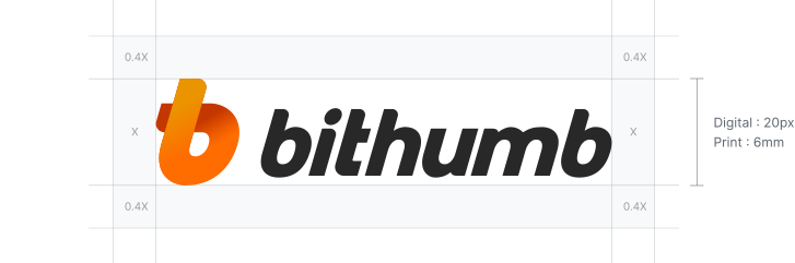
Clear Space & Minimum Size
To ensure visibility, clear space and minimum size rules must be maintained.
Sufficient clear space must be secured to prevent overlap with other graphics, and the logo must meet or exceed the specified minimum size.
Brand Colors
Brand colors are core assets driving Bithumb’s visual communication.
Bithumb Orange, Bithumb Orange Gradient and Bithumb Black harmonize to create a balanced visual identity.
Bithumb Orange
- HEX#FF6C00
- RGB255 / 108 / 0
- CMYK0 / 72 / 100 / 0
- PMS1505 C
Bithumb Orange Gradient
- HEX#FF9100
- RGB255 / 145 / 0
- CMYK0 / 52 / 100 / 0
- HEX#FF6C00
- RGB255 / 108 / 0
- CMYK0 / 72 / 100 / 0
- HEX#DC3700
- RGB220 / 55 / 0
- CMYK0 / 92 / 100 / 0
Bithumb Black
- HEX#282828
- RGB40 / 40 / 40
- CMYK0 / 0 / 0 / 92
- PMS426 C
Misuse
Adhering to correct logo usage guidelines is essential to maintaining a strong brand identity.
Avoid the following misuse cases:
-

Do not use the logotype in isolation.
-

Do not alter the colors of the logo.
-

Do not distort the proportions of the logo.
-

Do not change the typeface of the logo.
-

Do not create arbitrary combinations.
-
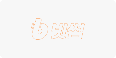
Do not apply outlines or line-art styles to the logo.
-

Do not apply any visual effects to the logo.
-

Do not place the logo on low-contrast background colors.
-
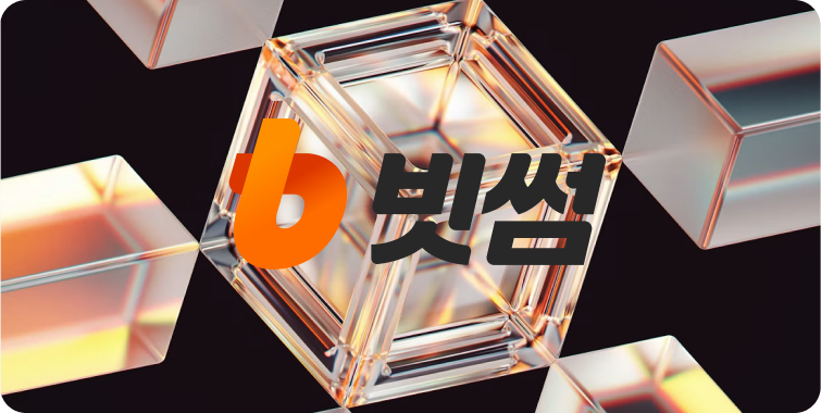
Do not place the logo over busy images.

Bithumb Co., Ltd. 11, 14~18F, 124, Teheran-ro, Gangnam-gu, Seoul, Korea Company registration No. 220-88-71844
Inquiry Email : [email protected] Listing Inquiry : https://listing.bithumb.com Partnerships : [email protected]
Bithumb Exchange : https://www.bithumb.com
COPYRIGHT (c) Bithumb Co., Ltd. All RIGHTS RESERVED.